Expense Insights
Expense Insights turns your expense data into a spending dashboard — how much is being claimed, on what, and how much is still awaiting approval.
Open the Reports & Insights area and click Expense Insights under Manage. As with the other dashboards, a date-range selector in the top right controls the period shown.
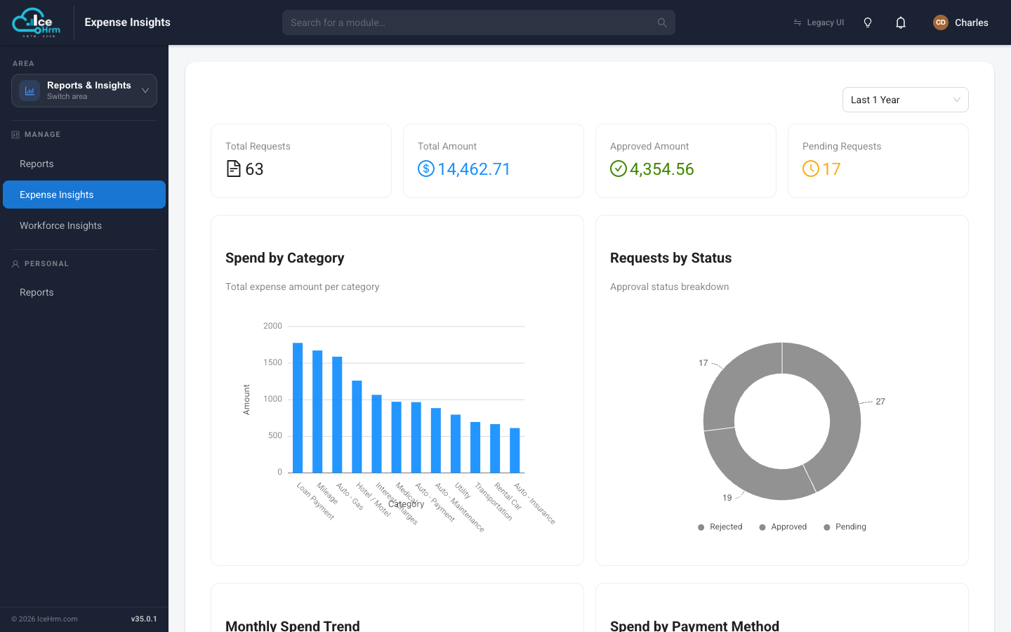
Summary cards
Across the top you get the headline numbers for the period:
- Total Requests — how many expense claims were submitted.
- Total Amount — the total value of those claims.
- Approved Amount — how much has been approved.
- Pending Requests — how many are still waiting for a decision.
Charts
- Spend by Category — a bar chart ranking categories (Mileage, Hotel, Fuel, and so on) by total amount, so you can see where the money goes.
- Requests by Status — a doughnut chart splitting claims into Approved, Pending, and Rejected.
- Monthly Spend Trend — how spending rises and falls over time.
- Spend by Payment Method — a breakdown by how expenses were paid.
What it's good for
- Spotting which expense categories drive most of your costs.
- Keeping an eye on the pending backlog so approvals don't pile up.
- Comparing spend across months to catch unusual spikes.
For the underlying claim-by-claim data, use the Expense Report instead.