Workforce Insights
Workforce Insights shows leave and attendance patterns across your whole organisation as charts, so you can spot trends without reading raw data.
Open the Reports & Insights area and click Workforce Insights under Manage. It has two tabs — Leave and Time Tracking — and a date-range selector in the top right.
Leave tab
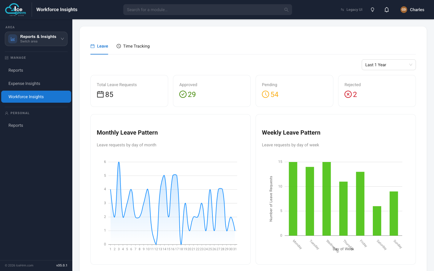
The summary cards across the top show your leave totals for the selected period: Total Leave Requests, Approved, Pending, and Rejected.
Below them are two charts:
- Monthly Leave Pattern — leave requests by day of the month. Use it to spot peak leave periods and plan staffing.
- Weekly Leave Pattern — leave requests by day of the week. Use it to see which days people most often take off (long weekends often show up as Monday/Friday peaks).
Scroll down for a breakdown by leave type and a leave-by-department view, so you can see which leave types dominate and which teams take the most leave.
Time Tracking tab
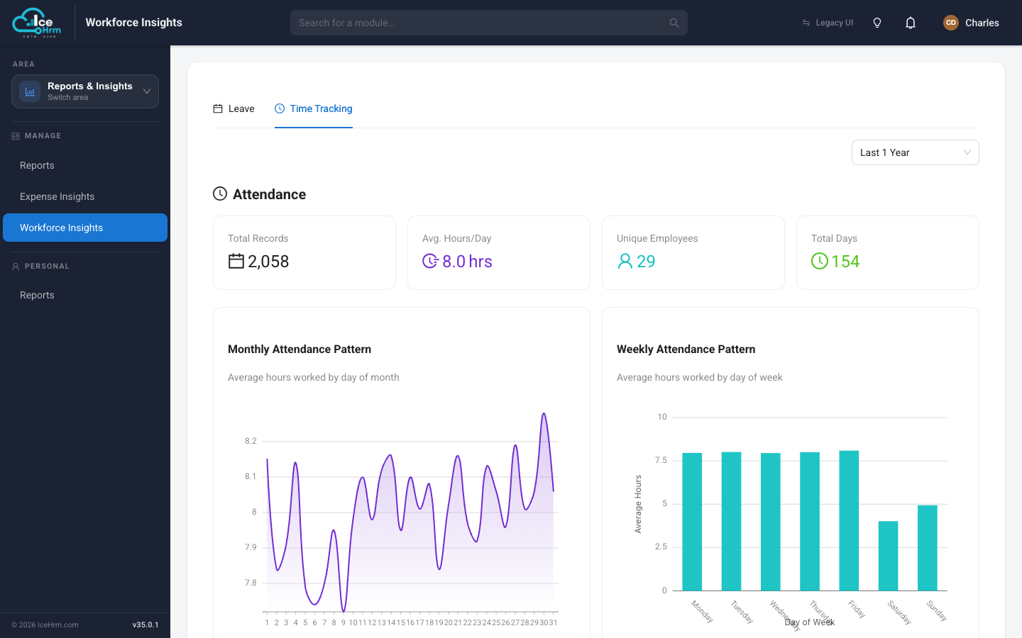
This tab focuses on attendance. The summary cards show Total Records, Average Hours/Day, Unique Employees, and Total Days for the period.
The charts are:
- Monthly Attendance Pattern — average hours worked by day of the month, to spot higher- and lower-activity days.
- Weekly Attendance Pattern — average hours by day of the week, to compare weekdays.
Further down you'll also find timesheet summary metrics (entries logged, average hours, employees, and projects), so you can compare recorded attendance against logged timesheet hours.
Using the date range
The selector in the top right (e.g. Last 1 Year) changes the period every card and chart covers. Widen it to see long-term trends, or narrow it to focus on a recent month.